
Last week, Moscow Dynamo celebrated its 103rd birthday and at the same time the centenary of the corporate letter "D", invented by one of the first football players of the team, Alexander Borisov. We decided to dig around and find out which emblems of popular clubs appeared even earlier and have reached our days without major changes.
In Russia, Dynamo has no competitors: the Spartak diamond with the letter "C" appeared in 1935, a year later the Torpedo "T" and the first Locomotive train leaving the letter "L" appeared. The Zenit arrow was released in 1940, and the CSKA logo, vaguely resembling the current one, in general, in the early 1960s.
But in Europe, football originated earlier than in our country, respectively, and the future grandees received their first emblems a couple of years, and sometimes several decades earlier.

Of course, a large number of historical logos can be found in England, which claims to be the ancestor of football. The Scotsman William McGregor, considered the founder of the English football League, chose the Rising Lion, the national emblem of his homeland, as a symbol of Aston Villa, where he worked as a director, back in the late 1870s. Over time, the lion changed its color from red to yellow, but it still remains on the logo of one of the oldest clubs in the world.
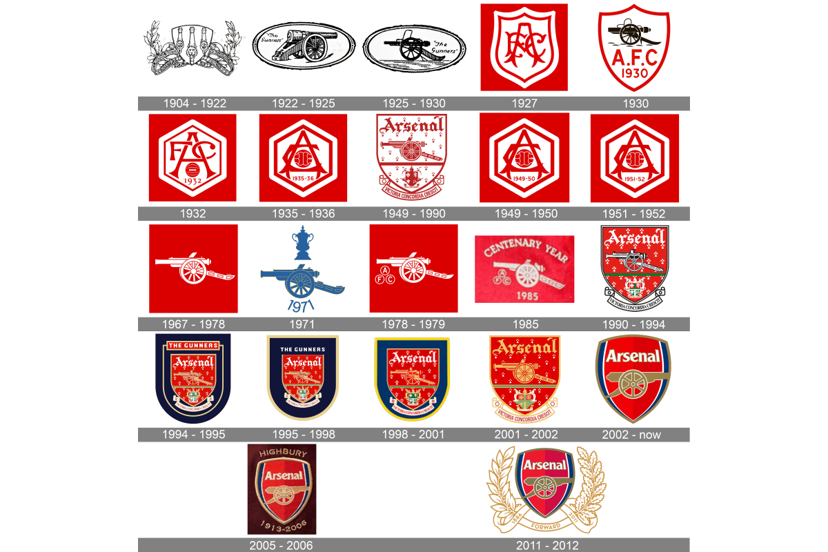
The current leader of the Arsenal submarine was founded in 1886 by workers at the Woolwich Artillery factory in southeast London, and two years later its first emblem was approved, which featured three guns looking up. In 1922, the gun was left alone and acquired a more familiar look for us. Over time, its image and the direction of the shot changed, but the gun still adorns the Arsenal coat of arms even now.
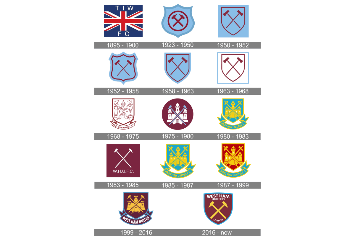
They also remember their industrial roots in another capital club, West Ham United. The nickname of the club – "hammers" – is a reference to the early history of the team, which at the dawn of its existence consisted of employees of the shipbuilding and metallurgical plant on the Thames. And two famous crossed hammers became the symbol of the club in the early 20s of the last century. It is noteworthy that they changed color several times and, like the lion of the "Villa", from the originally red turned yellow.
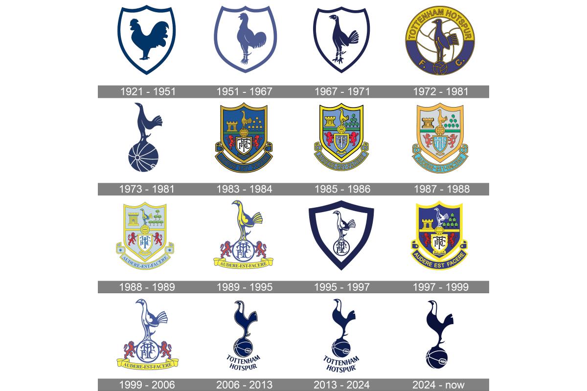
In 1921, the T-shirts of Tottenham Hotspur players were first decorated with a cockerel, which, although greatly modified, still remains the main symbol of the London club. Its history is more complicated: the club was named after the English knight of the XIV century Henry Percy, aka Harry Hotspur (which means "hot spur"). In Britain, cockfighting has been popular for a long time, in which participants often had spurs attached. Fortunately, in the middle of the XIX century they were still banned, but the memory of those times lives on the T-shirts of the club.
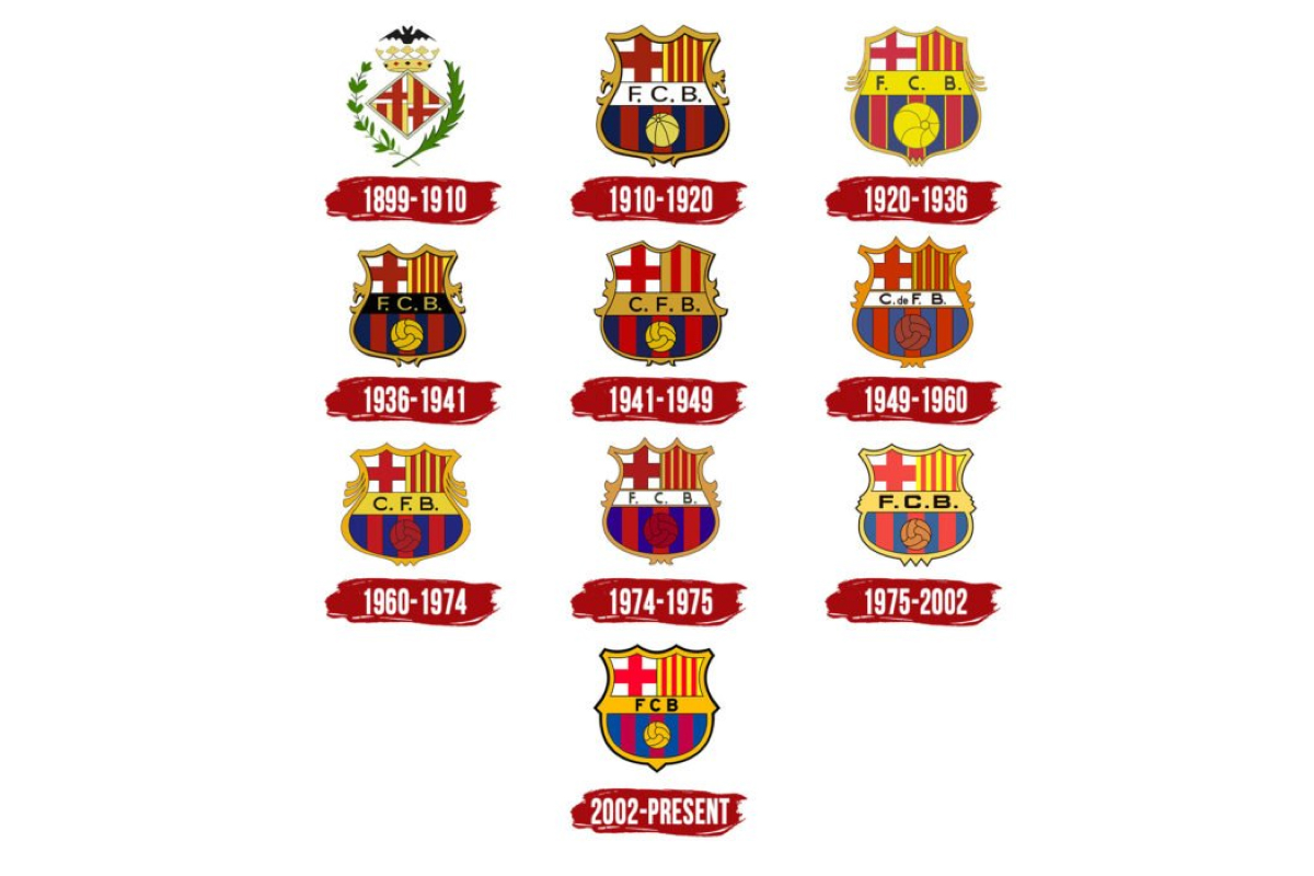
We are transported to Spain, and immediately stumble upon the almost unchanged logo of Barcelona, which has come down to us since 1910: the cross of St. George and the flag of Catalonia in the top row, under it the inscription FCB and the ball on the background of club colors. Amazing constancy, but for the first 11 years of existence, Barca had a completely different emblem – a diamond divided into four parts and crowned with the Aragonese crown and the bat of King James, surrounded by laurel and palm branches.
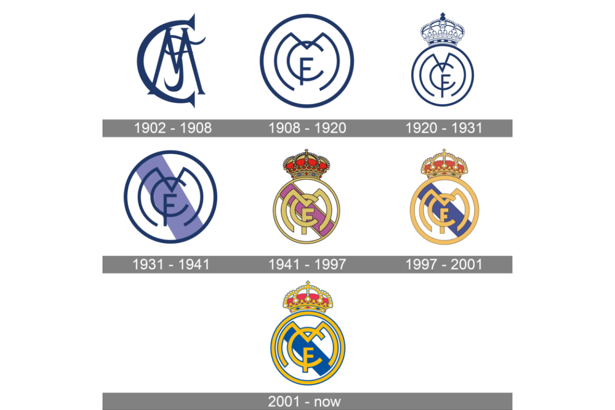
From this point of view, Real Madrid wins. After all, they had MCF (Madrid Club de Fútbol) symbols in their very first emblem of 1902, framed in a circle a little later. In 1920, a royal crown appeared above it, which disappeared for 10 years in the 30s, but then returned even more elegant.
Another capital grandee, Atletico, initially also experimented with the letters C and A, and in 1917 simply took seven stars and a bear with a strawberry tree from the coat of arms of Madrid, adding club red and white stripes. To this day, the "mattress pads" use it.

The eternal German confrontation between Borussia and Bavaria on football fields often ended with the victory of the latter, but the corporate logo of the Dortmund club – the letters VBV 09 in a yellow circle – appeared in 1919. But the first similar to today's Munich emblem with recognizable white and blue Bavarian diamonds is a year later. And it changed a lot more often than Borussia.
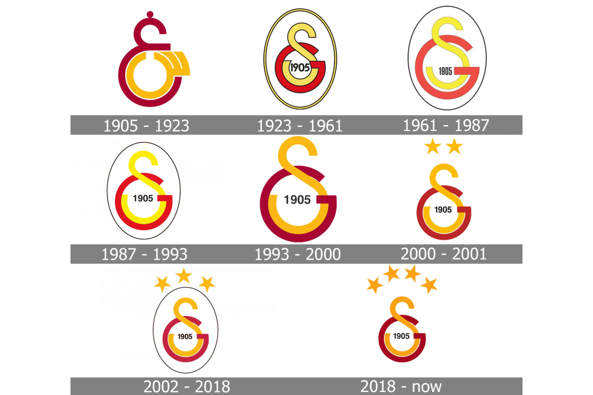
In an equally heated battle between Galatasaray and Fenerbahce, the first wins. In the very first emblem of 1905, you can see a recognizable interlacing of two capital letters in the name of the club, although at first they were Arabic, until in 1923 they gave way to Latin S and G. Later, in fact, champion stars were added to them.
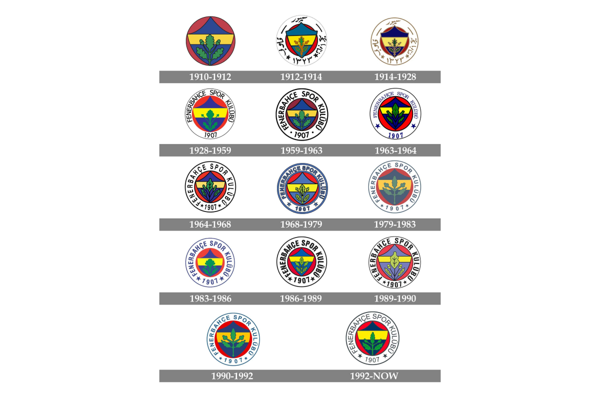
As for Fener, its emblem, like Dynamo's, was proposed by club player Hikmet Topuzer in 1914 – it combined the colors of the club and the national flag, and also added an oak leaf symbolizing strength. Later, the Arabic spelling of the club's name gave way to Turkish.
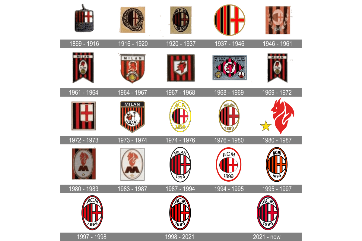
In Italy, we give the championship to Milan. Red and black stripes and the cross of St. George were on the original emblem of 1899. Later they were framed in the form of an elongated oval, and the year of the club's foundation was added. After that, perhaps the English letters MFCC (Milan Football and Cricket Club) were changed to more suitable Italian ACM (Associazione Calcio Milan).
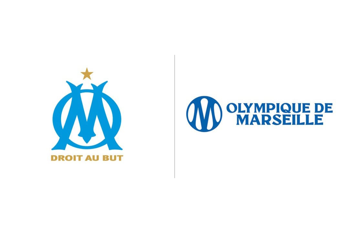
So far, it is possible to put the French Olympic Marseille, which was born in the same year, in the same row. Its founder Rene Dufort de Montmirail took as a basis his own seal with the letters D and M and simply replaced D with O so that the logo matches the name of the club. And the slogan "Droit au but" (straight to the goal) came from the rugby section and, according to legend, was the personal motto of Rene's bride. Only from next season, after the rebranding, it will disappear, and the logo itself will become minimalistic, for which it has already received a comparison from fans with a car badge.
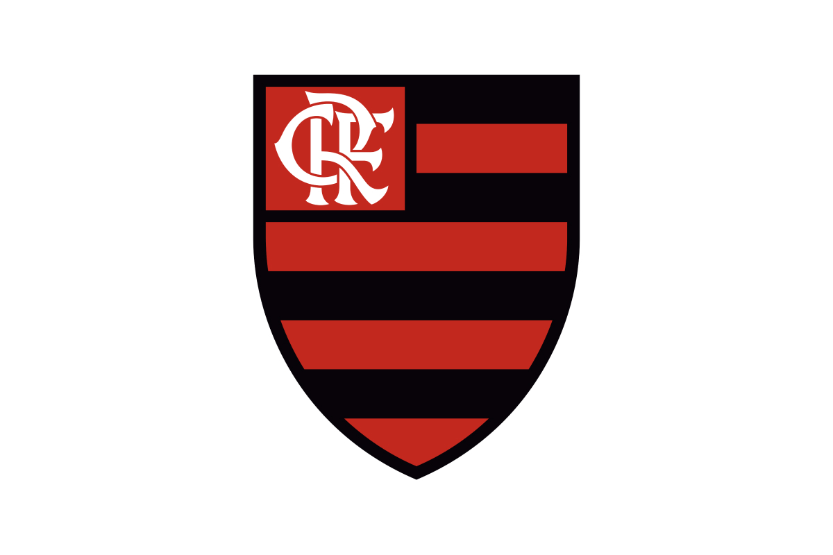
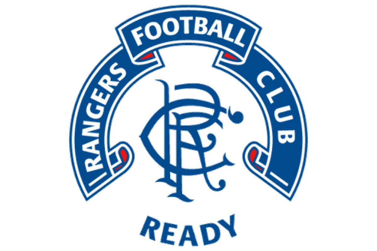
For a snack we will go overseas. In the homeland of the pentacampeons, Flamengo was originally a rowing club, in which visiting Scots also performed. According to legend, that is why the football team that appeared in 1911 received a logo that strongly resembles the one that the Scottish Rangers had. The intertwining letters C R F are very conveniently located in the name of both clubs (Clube de Regatas do Flamengo and Rangers Football Club).
In neighboring Argentina, Boca Juniors acquired an emblem in 1915 – a yellow-blue shield with the inscription CABJ (Club Atlético Boca Juniors). Over the past time, numerous stars have appeared and disappeared on it, increasing with the number of trophies won, but last month it was decided to abandon them, and the logo regained its almost pristine appearance.
